
Responsive Web Design: Crafting Seamless User Experiences Across Devices

Custom Web Development: Unlocking Tailored Digital Solutions
May 22, 2024
Enhancing User Experience (UX) for Optimal Engagement
May 22, 2024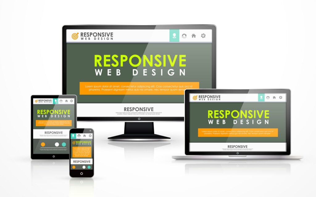
Responsive Web Design: Crafting Seamless User Experiences Across Devices
Introduction
In today’s digital age, users access websites from a plethora of devices, including smartphones, tablets, laptops, and desktops. Ensuring a consistent and optimized user experience across these varied devices is critical for the success of any online presence. This is where responsive web design (RWD) comes into play. Responsive web design is a design approach that enables websites to adapt to different screen sizes and orientations, providing a seamless experience for users regardless of the device they use. This blog will delve into the fundamentals of responsive web design, its benefits, implementation techniques, and best practices.
Thank you for reading this post, don't forget to subscribe!What is Responsive Web Design?
Responsive web design is a methodology aimed at crafting websites that provide optimal viewing and interaction experiences across a wide range of devices. It involves using flexible grids, fluid layouts, and CSS media queries to ensure that the website’s layout adjusts dynamically based on the screen size and resolution of the device.
Benefits of Responsive Web Design
- Improved User Experience: Responsive web design ensures that users have a consistent and enjoyable experience, whether they are browsing on a smartphone or a large desktop monitor. This enhances user satisfaction and engagement.
- Increased Mobile Traffic: With the significant rise in mobile internet usage, having a responsive website is crucial for capturing and retaining mobile users. A mobile-friendly website can lead to increased traffic and lower bounce rates.
- Better SEO Performance: Search engines like Google favor responsive websites because they provide a better user experience. A single, responsive website with consistent content and URL structure improves search engine optimization (SEO) efforts.
- Cost Efficiency: Maintaining a single responsive website is more cost-effective than developing and managing separate versions for desktop and mobile. It reduces development time and maintenance efforts.
- Future-Proofing: Responsive design ensures that your website is prepared for future devices and screen sizes. As new devices emerge, a responsive website can adapt without the need for significant redesign.
Key Principles of Responsive Web Design
- Fluid Grids: Fluid grids use relative units like percentages instead of fixed units like pixels to define the width of elements. This allows the layout to scale proportionally based on the screen size.
- Flexible Images: Flexible images adjust to fit within the containing element. This is achieved using CSS properties like
max-width: 100%;which ensures that images scale down appropriately on smaller screens. - CSS Media Queries: Media queries are a cornerstone of responsive design. They allow developers to apply different styles based on the characteristics of the user’s device, such as screen width, height, orientation, and resolution.
- Responsive Typography: Text size and line height should also be flexible. Using relative units like
emorremfor font sizes ensures that text scales appropriately across different devices.
Implementing Responsive Web Design
- Viewport Meta Tag: The viewport meta tag is essential for responsive design. It controls the layout on mobile browsers by specifying the viewport’s width and scale. Example:
html
<meta name="viewport" content="width=device-width, initial-scale=1.0"> - Using Media Queries: Media queries enable different styles for different devices. Example:
css
/* Base styles */
body {
font-size: 16px;
}/* For tablets and larger screens */
@media (min-width: 768px) {
body {
font-size: 18px;
}
}/* For desktops and larger screens */
@media (min-width: 1024px) {
body {
font-size: 20px;
}
}
- Flexible Grid Layouts: Use CSS Grid or Flexbox to create flexible layouts that adapt to different screen sizes.
css
.container {
display: flex;
flex-wrap: wrap;
}.item {
flex: 1 1 100%;
}@media (min-width: 768px) {
.item {
flex: 1 1 48%;
}
}@media (min-width: 1024px) {
.item {
flex: 1 1 31%;
}
}
- Optimizing Images: Use responsive image techniques to ensure images look good on all devices. The
srcsetattribute allows for different images to be loaded based on screen size and resolution.html<img src="image-small.jpg"
srcset="image-small.jpg 600w, image-medium.jpg 1200w, image-large.jpg 1800w"
sizes="(max-width: 600px) 100vw, (max-width: 1200px) 50vw, 33vw"
alt="Responsive image">
Best Practices for Responsive Web Design
- Mobile-First Approach: Design for the smallest screen first and progressively enhance the experience for larger screens. This ensures a solid foundation for mobile users.
- Minimize and Optimize Resources: Reduce the size of images, CSS, and JavaScript files to improve load times on mobile devices. Use tools like Gzip, image compression, and minification.
- Test Across Devices: Regularly test your website on various devices and browsers to ensure compatibility and performance. Emulators and real device testing can help identify issues early.
- Use Frameworks Wisely: CSS frameworks like Bootstrap and Foundation offer built-in responsive design components. However, customize them to avoid bloat and ensure they meet your specific design needs.
- Focus on Content: Prioritize essential content and functionality on smaller screens. Use techniques like progressive disclosure to reveal additional information as needed.
Conclusion
Responsive web design is not just a trend; it is a necessity in the modern digital landscape. By embracing responsive design principles, businesses can ensure that their websites provide a consistent, engaging, and accessible experience across all devices. This approach not only enhances user satisfaction but also boosts SEO performance, increases mobile traffic, and future-proofs the website against emerging technologies. Implementing responsive web design requires careful planning, testing, and optimization, but the rewards in terms of user engagement and business growth are well worth the effort.
Invest in responsive web design today to create a versatile, user-friendly, and resilient online presence that meets the demands of an ever-evolving digital world.
For More Information: https://www.ecbinternational.com
