The Art and Science of Typography: A Comprehensive Guide

Enhancing User Experience (UX) for Optimal Engagement
May 22, 2024
E-commerce Web Development: Building Successful Online Stores
May 22, 2024The Art and Science of Typography: A Comprehensive Guide
Introduction to Typography
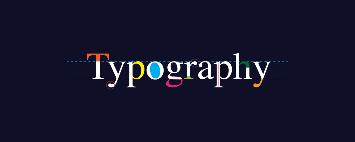
Typography is the art and technique of arranging type to make written language legible, readable, and visually appealing. It’s a vital aspect of design that impacts how your message is perceived.
Thank you for reading this post, don't forget to subscribe!The Importance of Typography in Design
Typography isn’t just about choosing pretty fonts. It’s about creating harmony and ensuring the text is easy to read. Good typography can enhance the readability, impact, and mood of your content.
Key Elements of Typography
Fonts and Typefaces
Fonts and typefaces are the building blocks of typography. A typeface is a family of fonts, while a font is a specific style within that family. For instance, Arial is a typeface, while Arial Bold is a font.
Hierarchy and Contrast
Establishing hierarchy and contrast helps guide readers through the content. Use different font sizes, weights, and styles to create visual interest and emphasize key points.
Alignment and Spacing
Proper alignment and spacing are crucial for readability. Left-aligned text is generally easier to read. Adequate line spacing and letter spacing ensure the text doesn’t feel cramped.
Choosing the Right Typeface
Selecting the right typeface sets the tone for your content. Serif fonts are often seen as traditional and trustworthy, while sans-serif fonts are modern and clean. Choose a typeface that matches the message you want to convey.
Readability vs. Legibility
Readability
Readability refers to how easily a reader can understand the text. It involves factors like font choice, size, and spacing. High readability ensures your audience can effortlessly consume your content.
Legibility
Legibility, on the other hand, is about how easy it is to distinguish one letter from another. Clear, distinct letters contribute to overall legibility, making your text easy to read even at smaller sizes.
The Role of Color in Typography
Color plays a significant role in typography. It can highlight important information and evoke emotions. Ensure sufficient contrast between text and background to maintain readability.
Web Typography Best Practices
Responsive Typography
With the rise of mobile devices, responsive typography has become essential. Ensure your text scales appropriately across different screen sizes without losing readability.
Web Fonts
Web fonts enhance the visual appeal of your content. Google Fonts and Adobe Fonts offer a vast library of web-safe fonts that ensure consistent display across various browsers and devices.
Common Typography Mistakes to Avoid
Overloading with Fonts
Using too many fonts can make your design look chaotic. Stick to two or three complementary fonts to maintain a cohesive look.
Ignoring Spacing
Inadequate spacing can make your text hard to read. Pay attention to line height, letter spacing, and margins to improve readability.
Poor Contrast
Ensure your text stands out against the background. Low contrast can strain readers’ eyes, making it difficult to engage with your content.
Conclusion
Typography is more than just selecting fonts. It’s about creating a visual structure that enhances readability and engages your audience. By understanding and applying typography principles, you can elevate your design and effectively communicate your message.
For more information: www.ecbinternational.com


